In this section, we’ll look at a variety of ways to represent data. You’ll see that some data can be represented in more than one way and will study how these different methods are put to use.
In statistics, there are many ways to analyze and display data. One of the most important features of data display is the assurance that the audience will understand the data and their implications. To review some of the methods we use to display data in figures, we will start with some of the basics.
Line Graphs
Line graphs are used to display two-variable data that change continuously over time. Line graphs are good for showing trends in data. That is, they clearly show how one variable is affected as the other increases or decreases. They’re also good for making predictions of values outside the data set.
Line Graphs
Below is a table that shows the population of a city over time. Next to it is a line graph that displays the same information. It shows the population on the vertical axis and the time in years on the horizontal axis.
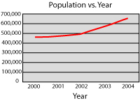
| Year |
Population |
| 2000 |
455,000 |
| 2001 |
470,000 |
| 2002 |
500,000 |
| 2003 |
570,000 |
| 2004 |
655,000 |
The population has been increasing for five years, so it’s reasonable to expect it to continue. We could predict with some confidence that it will continue to increase and that the population in 2005 will be over 700,000. Of course, it’s quite possible that it won’t be, but predictions are as good as educated guesses.
Bar Graphs
Bar graphs are used to compare discrete (not continuous) quantities in different categories. The height of bars in a vertical bar graph and the length of bars in a horizontal bar graph are proportional to the numbers they represent. Bar graphs are quite useful for displaying results to a survey, in particular.
Bar Graphs
Below is a table that shows the number of students that travel to school in each of four categories. Below the table is a bar graph that displays the same information.
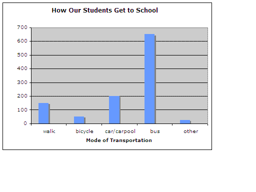
| Number of Students |
Way to School |
| 150 |
walk |
| 50 |
bicycle |
| 200 |
car/carpool |
| 650 |
bus |
| 25 |
other |
Stem-and-Leaf Plots
A stem-and-leaf plot organizes data to show its shape and distribution.
Stem-and-Leaf Plots
In a stem-and-leaf plot, each data value is split into a stem and a leaf. The leaf is the digit in the place farthest to the right in the number, and the stem is the digit, or digits, in the number that remain when the leaf is dropped. The number ninety-five would have a stem of nine and a leaf of five. The number 123 would have a stem of twelve and a leaf of three.
Here are the heights in inches of the twenty people on my baseball team:
{60”, 66”, 71”, 63”, 58”, 61”, 70”, 73”, 59”, 65”,
60”, 64”, 57”, 71”, 71”, 66”, 69”, 64”, 61”, 65”}
To construct a stem-and-leaf plot, first order the data from least to greatest. The ordered set looks like this:
{57”, 58”, 59”, 60”, 60”, 61”, 61”, 63”, 64”, 64”,
65”, 65”, 66”, 66”, 69”, 70”, 71”, 71”, 71”, 73”}
The next step in creating the stem-and-leaf plot is to identify the stems. The stems are the digits that remain when the rightmost digit is removed from each value. (Those removed digits are the leaves.) The stems of this set will be five, six, and seven.
Now we can draw the plot:
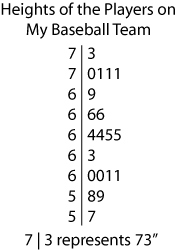
There are a couple of important points to notice about the plot. First, notice that the plot contains a key that describes the values in the data set. Second, notice that the plot makes the median, mode, and range relatively simple to find.
Frequency Tables and Histograms
Frequencies tables and histograms are given together because, like line and bar graphs, a histogram is easier to create if a table of the data is constructed first. In addition, a stem-and-leaf plot looks a bit like a histogram turned on its side. You’ll see.
A frequency table is a chart that shows the number of times that values within each interval of a data set occur. A histogram is a bar-graph representation of the data in a frequency table that shows the proportion of data that fall into categories. The categories are nonoverlapping intervals of the data distribution.
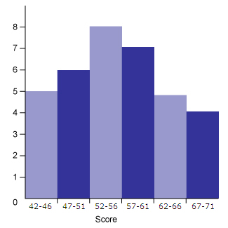
These representations are best demonstrated with an example. Let’s look at the ages of the members of a small golf club.
Here’s the ordered set:
{42, 43, 43, 44, 46, 47, 47, 47, 48, 48, 48, 52, 52, 53, 54, 54, 54, 55, 56, 57, 57, 57, 57, 59, 60, 61, 62, 63, 64, 66, 66, 68, 69, 70, 71}
Step by Step:
- Decide on the number of classes, or bins. The width of the intervals depends on these. The table below shows 6 classes.
- Now find the widths of the intervals: Widths of five years are shown on the table below.
| Class |
Frequency |
| 42 – 46 |
5 |
| 47 – 51 |
6 |
| 52 – 56 |
8 |
| 57 – 61 |
7 |
| 62 – 66 |
5 |
| 67 – 71 |
4 |
This table shows that most people in this club are between 52 and 56 years old.
Here’s a histogram of the data in the frequency table:
Question
In a stem-and-leaf plot of the data that is displayed in the histogram below, how many leaves would a stem of 5 have?
- 8
- 11
- 21
- Cannot be determined
Reveal Answer
Choice D is the correct answer. This one is a bit tricky. There are three intervals in the histogram that contain the stem of 5 (those between the ages of 50 and 59). One contains the number of members between 47 and 51 years old, another contains those between 52 and 56 years old, and finally one showing those between 57 and 61 years old. One of these drifts below 50 and one stretches above 60 meaning that the number of those between 50 and 59 years old cannot be determined.
Normal Distribution
Normal distributions are the ideal data distributions and are bell-shaped curves (histograms) like this one:
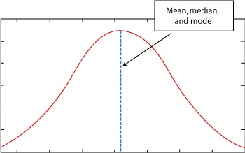 The peak of the curve is where the mean, median, and mode all lie. Remember, this is a histogram, so it shows that more values in the set are concentrated in the middle than in the tails.
Pick any point on the curve. The farther it is from the mean (and the median and mode), the less likely it is to appear in the set. The closer it is to the mean, the more likely it is to appear in the set.
For example, suppose this curve is actually a histogram of exam scores in your class. Then most of the scores are close to the mean, and the fewest are farthest from the mean. In other words, suppose the mean of the test is 86. Then it is more likely that a student received a grade of 80 than a grade of 50.
We’ll look back at the normal distribution when we explore probability.
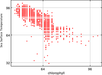
Scatterplots
A scatterplot is a graph, or collection of points, of two-variable numerical data. Like line graphs, scatterplots are quite useful for showing trends in data.
Here’s a good example of a scatter plot, courtesy of NASA, showing how data are tracked in a scatterplot. One of the most useful ways to display large amounts of data, the scatterplot is also one of the most basic and easy to construct. Notice how easy it is to interpret how sea surface temperatures and chlorophyl are related from this scatterplot.
Question
For which of the following data sets would a line graph be more appropriate than a scatterplot?
- A set of data that gives the altitude of a plane as it descends to a runway
- A set of data that gives the ages of all of the principals in a school district
- A set of data that gives the height and arm span of a classroom of students
- A set of data that gives the annual sales for ten different restaurants for one year
Reveal Answer
Choice A is the correct answer. A line graph is used to display values that change over time. A line graph could show the altitude of the airplane at several points throughout its descent. Choice B is incorrect, because data of this kind is best represented in a histogram. Choice C is incorrect, because data of this kind is best represented in a scatterplot.
Box-and-Whisker Plots
The last type of representation of data that we’ll explore in this section is a box-and-whisker plot. A box-and-whisker plot reveals a five-number summary of a data set. These five numbers are the mean, the upper and lower quartiles, and the maximum and minimum values in the set.
Box-and-Whisker Plots
Here’s a good example of data displayed with a box-and-whisker plot from the EPA. Notice that this figure supplies a tremendous amount of information about the range, median, and the 25-75% quartile ranges of these data – all in a format that is easy to understand and conserves the amount of pixels (or ink) to get these data summary statistics across to the audience.
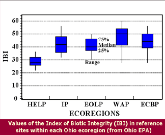
That said, we need some more definitions.
Recall that the median of a data set is the number in the middle. Half of the values lie above it and half of the values below it.
A quartile is one fourth of the data values in a set.
The upper quartile is the median of the upper half of the set. One fourth of the data values lie above the upper quartile.
The lower quartile is the median of the lower half of the set. One fourth of the data values lie below the lower quartile.
Review
- Line graphs are used to display two-variable data that changes continuously over time.
- Bar graphs are used to compare discrete (not continuous) quantities in different categories.
- A stem-and-leaf plot is a display that organizes data to show its shape and distribution.
- A frequency table is a chart that shows the number of times that values within each interval of a data set occur. A histogram is a bar-graph-like representation of the data in a frequency table.
- A scatterplot is a graph, or collection of points, of two-variable numerical data.
- A box-and-whisker plot reveals the mean, the upper and lower quartiles, and the maximum and minimum values in the set.