Graphs can be the best way to display, summarize, and simplify results of data. The most basic types of graphs that are used to present data are the:
Bar and line graphs are used to show results along a vertical (y axis) for a corresponding variable (such as sampling date or site) which is marked along the horizontal or x axis. These types of graphs can also have two vertical axes, one on each side, with two sets of results shown in relation to each other and to the variable along the x axis.
A bar graph uses columns with heights that represent the value of the data point for the parameter being plotted. Figure 6.1 is an example of a bar graph displaying biological data, the number of frog egg clutches found per plot from April 1997 to May 1998.
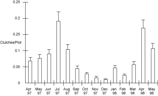
Figure 6.1
A line graph is constructed by connecting the data points with a line. It can be effectively used for depicting changes over time or space. This type of graph places more emphasis on trends and the relationship among data points, and less emphasis on any particular data point.
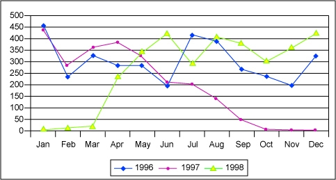
Figure 6.2: Example of a line graph used correctly to show the large impact of the 1997-1998 El Niño Southern Oscillation effect on precipitation on the island of New Guinea
Pie charts can be used to compare different categories within data relative to all categories. The proportion of each category is represented by the size of the wedge or piece of the pie. Pie charts have become popular because they are useful and simple. Figure 6.3 is an example showing the relative proportions of clutches from different kinds of frogs found in the 1998 field season.
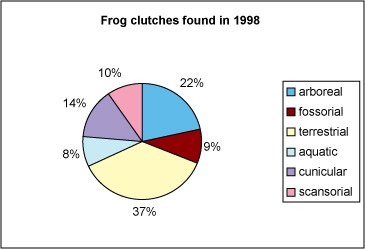
Figure 6.3 This pie chart accurately shows the different numbers of frog clutches found in 1998. Each category is a separate micro-habitat where the frogs live and lay their eggs.
No matter what kind of figure you use, there are some good guidelines to follow so that you can use them most effectively. Each figure should have a clear function and should be easily interpreted. Every good figure relates directly to the content and context of the subject matter. Another important thing to keep in mind is bias. Like any other part of science, bias needs to be a major concern during the presentation of results, so that no undue distortions or introduced ambiguities negatively affect the presentation of your results. It cannot be overstated that we need to ensure the accuracy of the results.
The data in a figure should be proportional to the real data, labeling should be clear and accurate, and the data should be easily interpreted from the figure directly or via the figure legend. Never overcrowd the axes of a graph or the legend of a figure. If you think there might be any possibility of misinterpreting the figure, redo it. Figures are often your best tool for relaying complex information or large amounts of data. They are worth the extra time and effort you put into them and you should let your students appreciate this.
Try to keep it simple. A basic rule is to use the least amount of ink or pixels per/datum. The more complex a figure, the greater the chances that people will either misinterpret your data or not understand what you are trying to show.
Limit the number of parts in a figure. For example, line graphs should have fewer than five lines, pie charts should be limited to five or six wedges, and the bars of a bar graph should not be too crowded.
Consider the size of the figure you want and make the components of the figure fill the space effectively. You want the reader or viewer to be able to extract the necessary data with ease and efficiency. Figure that are too small or too crowded only make this harder and less efficient.
Create simple and short titles that adequately describe the information portrayed in the figure. Don’t use acronyms or abbreviations unless you are absolutely certain that your audience will know what you mean. Use figure legends appropriately and do not try to put too much information or too little information in the legend. It should compliment the figure, not detract from its effectiveness.
Figures in a scientific report or presentation should
The correct answer is C. Figures in scientific reports need to get all the information across as simply as possible. Complex figures that include abbreviations, ambiguous interpretations, or too much noise are not useful and do not get information across to the audience.
Summary statistics are extremely useful for reducing large, unwieldy data to just a few descriptive values. They can often take pages of data and turn them into a few values that can be much more quickly understood. Summary statistics are important to almost any study and include the mean, standard deviation, and number of data points (n).
In statistics we usually assume that if a parameter is measured multiple times under the same conditions, the measurements are randomly distributed around an average with more clustering around the average than further away. A graph of the frequencies of each value typically is a bell-shaped curve for normally distributed data. As you know from basic statistics, the mean and standard deviation determine the height and width of this curve.
Although both the mean and standard deviation are useful in describing most data, often in the natural sciences, real data often do not fit a normal distribution. In these cases, we have other statistics to describe the data. Many data seem to be skewed in one direction while others have a more flattened bell shape.
It is important to note that biological data, in particular, often does not follow a normal distribution because life is complex and many interdependent systems are usually affected by whatever perturbation or experimentation we attempt to force upon them. In many of these cases where the data is abnormally distributed, the mean and the standard deviation are not appropriate summaries of the statistics and we need to either transform the data or come up with better descriptors for the abnormal data.
For describing abnormally distributed data, we use statistics that still convey the information but are not overly influenced by data points at the extremes of the distribution. The median, the range, and sometimes the interquartile range are used to describe both the central tendency and the spread of the data. We know that the median is the value that is physically in the middle of the data set. The range is simply the entire range of values from the data, and the interquartile range is the difference between the value at the 75-percent level and the value at the 25-percent level. We can use another type of figure to help show abnormal data that encompasses these characteristics, called a box and whisker plot. A box and whisker plot graphically displays the mean, median, variation, skew, range, and size of the data. In some cases, you do not need to show the quartile range if the range itself is sufficient to show the skew of the data. Figure 6.4 shows how this works with data from the number of eggs in a clutch for different types of frogs.
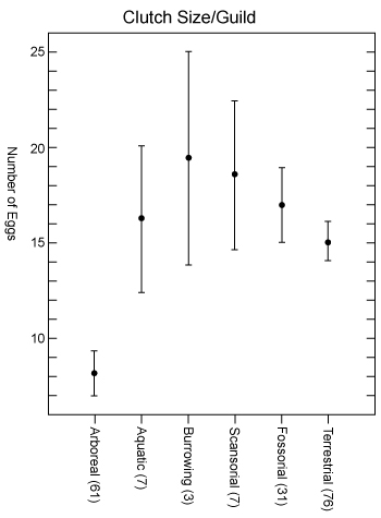
Fig. 6.4 is an example depicting the extreme values and median of the number of eggs per clutch across six different micro-habitats. This is an example where the data are not normally distributed and need to be displayed in a slightly different way.
Displaying results of your study area on a map is most often the best way to show exactly where the study took place or how the data are distributed geographically. A map should show the location of study sites in relation to a reference and also clearly show features, such as human habitations, gardens, rivers, major mountains, and other attributes important for the study.
A map should be relatively simple and show only principal features that are cogent for the study or results. The map should have enough detail and correct scale to show location of sample sites, and whatever summary information is appropriate.
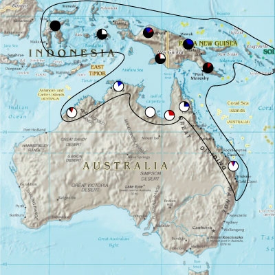
For example, if a map shows that gene frequencies are completely different on opposite sides of a large mountain range, use the information as a subtitle of the map and make sure that the map clearly shows the trend. Another good idea is to use an enlargement of the focal area on the map to adequately display the information and set the geography. You can also use different sized symbols and patterns to represent various magnitudes of the results. For example, a site with a sample size of 10 individuals could have a pie chart 10 mm wide, whereas a sample size of 90 individuals would be 90 mm in diameter. Start by finding the highest and lowest values, assign diameters and patterns to those and then fill in steps along the way.
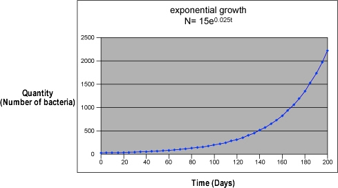
Data from an experiment does not always form a line on a graph. In some cases, the amount of y increases faster and faster as the amount of x also increases. In other words, it increases exponentially. A graph of exponential growth. is a curve that rises increasingly faster. Exponential equations are written in the form:
N(t) = N0ekt
where N0 represents the initial quantity, t represents the number of time intervals, N(t) is the quantity after time t, k is a constant that is characteristic of the growth, and ex represents an exponential function of base e.
When the number of objects decreases exponentially over time, the phenomenon undergoes exponential decay. Notice the graph of exponential decay shows an initial rapid decrease and then decreases at an increasing slower rate. Note also that the value approaches, but never crosses zero on the y axis. Examples of exponential decay include radioactive decay, in which the number of atoms of an isotope is decreased by half during a time period, known as the half-life, which is a characteristic of the particular isotope. The formula for exponential decay is: N(t) = N0e-kt

You can see that it is easy to read values on a graph of an exponential function when the values are changing rapidly, but when the change is slow, it is almost impossible to read the change in y on the graph with any precision. When data cover a wide range of values and rates of change, a logarithmic graph is generally more useful. The values with the wide range are plotted as the base 10 logarithm of their value.
Logarithms are used to express the magnitude of exponential functions, such as the strength of an earthquake. An earthquake of magnitude 7 is 10 times as strong as an earthquake of magnitude 6; 100 times as strong as an earthquake of magnitude 5; 1,000 times as strong as an earthquake of magnitude 4; and so on. Other values expressed logarithmically are the intensity of sound and the pH of a chemical solution.
The final and still important part of doing scientific investigation is keeping yourself and others safe while you work. In many ways safety both in the laboratory and the field is a matter of common sense. It doesn’t hurt, though, to repeat some of the key elements of safety. A few of the essential points include: