In this lesson, you will study how to organize data sets using methods such as frequency tables, histograms, standard line graphs, bar graphs, stem-and-leaf displays, and scatter plots. In addition, you will discuss normal distributions, as well as how to find a line of best fit using least squares regression.
The box-and-whisker plot is a useful way to display information relating to the distribution of elements in a data set. There are many other ways to graphically display the information in a data set. Different display methods can highlight different important properties of the data distribution.
What are histograms and frequency tables, and how are they related?
Just as a box-and-whisker plot arranges information in relation to the median of a data set, a frequency table provides information relating to the mode of a data set. A frequency table is a data display that lists the times that each element in a data set occurs. Often, the relative frequency is also displayed in a frequency table. The relative frequency is a value, given as a percent, that represents the number of times an element occurs in a data set.
For example, the number of points a local soccer team scored in their last 35 games is listed below.
![]()
Arrange this information into a frequency table.
The elements of this data set range from 0 to 5. The score 0 occurs 5 times. The score 1 occurs 6 times, 2 occurs 8 times, and so on.
| Frequency Table | ||
|---|---|---|
| Score | Frequency | Relative Frequency |
| 0 | 5 | |
| 1 | 6 | |
| 2 | 8 | |
| 3 | 7 | |
| 4 | 5 | |
| 5 | 4 | |
To compute the relative frequency of the score 0, we must divide its frequency (5) by the total number of elements in the data set (35). Therefore, we have ![]() . So, 0 occurs approximately 14.3% of the time. To compute the relative frequency of the score 1, we must divide its frequency (6) by the total elements,
. So, 0 occurs approximately 14.3% of the time. To compute the relative frequency of the score 1, we must divide its frequency (6) by the total elements, ![]() . So, 1 occurs approximately 17.1% of the time. Following the same method, we find that 2 occurs approximately 22.9% of the time, and 3 occurs approximately 20% of the time.
. So, 1 occurs approximately 17.1% of the time. Following the same method, we find that 2 occurs approximately 22.9% of the time, and 3 occurs approximately 20% of the time.
| Frequency Table | ||
|---|---|---|
| Score | Frequency | Relative Frequency |
| 0 | 5 | 14.3% |
| 1 | 6 | 17.1% |
| 2 | 8 | 22.9% |
| 3 | 7 | 20% |
| 4 | 5 | 14.3% |
| 5 | 4 | 11.4% |
A histogram is another type of display that can be used to graph information relating to frequency. In a histogram, bars are used to represent the number of times an element of a data set occurs.
Histograms sort elements. The x-axis denotes the categories, or classes, the elements will be sorted into, and the y-axis tells how many elements fall into each specific class. The class interval is a rule by which we define each of the classes that the elements of a data set will be sorted into when we organize a histogram. Many times the class interval of a histogram is a range of values, though this is not always the case.
The histogram below displays the information from the frequency table above. In this histogram, the class interval is defined as one goal. We could display the same information in a histogram with a different class interval.

Histograms are often displayed with a class interval larger than one unit. Thus, each class denotes a range of values rather than just one value. The histogram below displays the same information above with a class interval of 2 goals.

As a rule, histograms are drawn with no gap between the bars.. So, be sure to place the bars of a histogram right next to each other.
Occasionally, histograms are drawn with extra space between bars,
making them look more like bar graphs. We discuss the difference between histograms and bar graphs below.
An important thing to remember is that a histogram is a certain type of bar graph. In a histogram, we are using bars to display specific information about a data set. A histogram is like a frequency table that uses bars to represent the frequency. In histograms, there is only one variable to consider, and we categorize the elements of the data set using this one variable.
A bar graph, on the other hand, is more general. A bar graph uses bars to display information relating many measurements to many different items. For example, we would use a bar graph like the one below, not a histogram, to display how many points each soccer team scored at the last tournament.
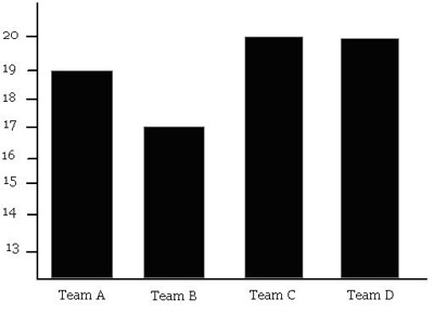
The big difference between histograms and bar graphs is that a histogram uses bars to display the frequency of just one variable, while a bar graph uses bars to relate many different measurements to many different items.
A line graph provides another method to display the information contained in a data set. More specifically, a line graph relates two variables, an independent variable and a dependent variable, within a data distribution. The x-axis denotes the independent variable, and the y-axis denotes the dependent variable.
Line graphs are very useful because not only do they provide a clear and concise way to represent data, they are also very useful in extrapolating and interpolating more refined information from a given data set. In addition, line graphs are often used to recognize a relationship between two variables and to make informed predictions for the future based upon the relationship displayed in the graph.
Dr. Connolly teaches Honors Calculus at a university. Over several years, Dr. Connolly has monitored the number of women that enroll in his class. He has compiled this information into the line graph below.
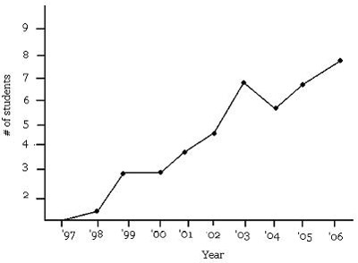
According to the line graph Dr. Connolly created, which statement below is NOT correct?
The correct choice is C. The number of women in the Honors Caclulus class has not been continuously increasing. In fact, there was a decline from 2003 to 2004.
We can extrapolate information that is not explicitly contained in a line graph by recognizing patterns in the data relationships. Though the number of enrolled women is not strictly increasing, there is an obvious trend toward more women in the Honors Calculus class. Based on this line graph, we can conjecture that in the coming years, there will be an even greater number of women enrolled in Dr. Connolly’s Honors Calculus class.
As previously stated, line graphs are very useful in noticing trends in a data set and making predictions for future developments based upon those trends. Another data display that is useful when determining the existence of a relationship between two variables is a scatter diagram, also called a scatter plot.
A scatter plot is a coordinate plane with points plotting one set of data values against another. Whereas the other methods for displaying data sets we have examined are based upon displaying a single variable in a data set., a scatter plot is used to compare two data sets, with one set being represented on the x-axis and the other on the y-axis.
Suppose we measured the height and shoe size of a large sample group of people. By plotting the height on the x-axis and the shoe size on the y-axis, we create the scatter plot below.
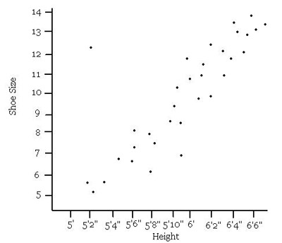
Which statement below is supported by the information in the scatter plot?
The correct choice is D. The scatter plot indicates that height and shoe size are directly proportional.
When interpreting a scatter plot, be wary of absolute statements, such as the statement made in choice
A. The lone point in the upper left corner shows that there was one person measured who is about 5 ft 2 in tall, with a shoe size of about ![]() .
.
Always be in the lookout for aberrational elements on a scatter plot. They can provide counterexamples to absolute statements. When making general statements, it is alright to ignore these aberrational elements, and describe the general trend of the data.
A data set can be very large and, by simply listing the elements in a data set, it can be hard to deduce any useful information. All the methods we have discussed provide ways to simplify the information in a data set. However, as we have seen, different display methods better at highlighting different properties of a data set. It is important to be familiar with each of the display methods so that we know how to best highlight a certain aspect of a data set.
Another method that is often used to arrange data into a more accessible format is the stem-and-leaf display. A stem-and-leaf display is similar to a histogram because it allows us to quickly count the number of elements in a data set that fall within a specific range.
Consider the data distribution {5, 16, 18, 4, 23, 25, 29, 31, 24, 35, 44, 42, 39, 51, 40, 50, 39, 22, 48, 57, 12, 65, 44, 33, 28, 29, 10, 9, 27, 8}.
To organize this data as a stem-and-leaf display, we let the stem be the ten’s place, and the leaf be the one’s place. Then we create the following table.
| Stem and Leaf Display | ||
|---|---|---|
| Stem | Leaf | |
| 0 | 4, 5, 8, 9 | |
| 1 | 0, 2, 6, 8, | |
| 2 | 2, 3, 4, 5, 7, 8, 9, 9 | |
| 3 | 1, 3, 5, 9, 9 | |
| 4 | 0, 2, 4, 4, 8 | |
| 5 | 0, 1, 7 | |
| 6 | 5 | |
Each element of the data set is represented, and we can quickly see that the greatest number of elements is between 20 and 30, because the leaf adjacent to the “2” stem is the longest.
If we define the class interval of a histogram as a very small interval, and create correspondingly small bars, we could easily imagine a curve created by the bars of the histogram. In fact, the smaller we make our class interval, the more accurate our curve will be.
Suppose we want to make a histogram that displays the heights of all the students in a particular high school. If we define the class interval as 6 inches, we get the following histogram.
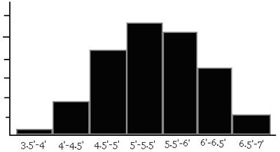
If we define the class interval as 0.1 inches, however, we get the histogram below.
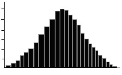
The resultant curve is called the normal curve, or the bell curve. The histogram tells us that the majority of the students in the high school are of average height, yet there are a couple of very tall and very short students. Data sets which follow this pattern are called normal distributions.
Many properties in nature and in behavioral and social sciences follow a normal distribution and produce a normal curve when mapped in this way.
The normal curve makes very natural statements about probability. Consider, for example, the histogram relating the IQ of a population, in which the class interval is one point. As with many phenomena in nature, a bell curve results.
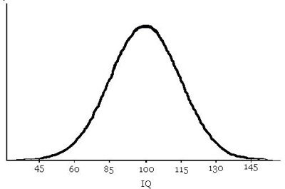
Probabilistically speaking, this curve states that the citizens in this population have an average IQ of about 100. As the IQ increases, the number of citizens with this IQ decreases. The bell curve tells us that there are very few citizens who qualify as genius(have an IQ above 140). However, there are equally few citizens with an IQ below 55. Thus, a citizen chosen at random will most likely have an average IQ, and it would be extremely unlikely to randomly pick a genius out of the population.
Using the language of standard deviations, we can make these statements much more precise. Examine the graph below.
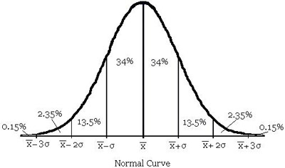
Each interval of standard deviation displays the probability that one of its elements will be randomly chosen. Note that the probabilities add up to 100% with 50% on either side of the mean value.
Recall: ![]() is the mean
is the mean ![]() is the standard deviation
is the standard deviation
The lengths of time for telephone calls in the Jones household approximate a normal distribution. If the mean length is 4.5 minutes, with a standard deviation of 1.5 minutes, about 84% of the calls are…
The correct choice is D. Use the normal curve, and fill in the appropriate values for the mean and standard deviations.
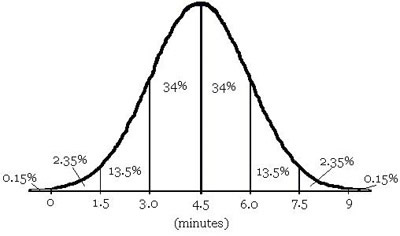
According to the chart, only 0.15% of the calls made are more than 9 minutes long, eliminating choice A. The percentage of calls between 4.5 and 9 minutes is 34 + 13.5 + 2.35 = 49.85%, which eliminates choice B. For choice C, according to the chart, the percentage of calls less than 4.5 minutes is 34 + 13.5 + 2.35 + 0.15 = 50%. Finally, according to the chart, the percentage of calls between 3 and 9 minutes is 34 + 34 + 13.5 + 2.35 = 83.85%, which is about 84%, confirming D as the correct choice.
The normal distributions and the normal curve it generates are very useful patterns of data distribution. These patterns of distribution can be found in naturally occurring phenomena, such as height, and in data sets used in the behavioral and social sciences, such as sets of IQ scores.
Much research in mathematics is devoted to finding a curve that accurately describes discrete data sets. A linear regression for a collection of data points is a linear equation that closely approximates the behavior of a collection of data points. The most popular method of finding a linear regression is the least squares method.
The term regression indicates that a linear equation is a less-than-perfect approximation of a data set. Indeed, it is very rare that a data distribution precisely mimics linear behavior. We can only create a good guess.
Recall that a linear equation is defined by the formula y = ax + b, where a and b are constants.
The method of least squares regression creates a linear equation that minimizes the square of the vertical distance between points in the data set and the corresponding values on the line.
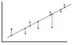
In the figure above, the points in the data set are black and the corresponding values on the line are blue. The resulting least squares regression line minimizes the value of the square of the distance, (denoted in red) between these two points.
Since a linear equation has the general form y = ax + b, we need to determine how to calculate the values of a and b in order to find a linear regression. Luckily, there are formulas we can use to calculate the values of a and b which will result in the least squares regression.
Suppose we are given the data set ![]() , and corresponding to each element of the data set, we have the ordered pairs
, and corresponding to each element of the data set, we have the ordered pairs ![]() . The following equations are used to compute the values of a and b.
. The following equations are used to compute the values of a and b.
Use the equations below to solve for a and b in the linear regression.
![]()
Which choice shows the least squares regression line for the data set below?
{(1, 1), (2, 4), (3, 2), (4, 4), (5, 3), (7, 9),
(8, 5), (9, 10)}
The correct choice is B. Before we begin plugging values into the equations above, let’s organize what we need to know by creating a table.
|
i
|
|
|
|
|
|
1
|
1
|
1
|
1
|
1
|
|
2
|
2
|
4
|
4
|
8
|
|
3
|
3
|
2
|
9
|
6
|
|
4
|
4
|
4
|
16
|
16
|
|
5
|
5
|
3
|
25
|
15
|
|
6
|
7
|
9
|
49
|
63
|
|
7
|
8
|
5
|
64
|
40
|
|
8
|
9
|
10
|
81
|
90
|
|
|
39
|
38
|
249
|
239
|
Now we can more easily compute the values for a and b.
 .
.
![]()
Thus the equation of the least squares regression line is y = x + 0.299.
In the figure below, the points of the data set are mapped with the corresponding least square regression line in red.
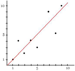
We now have a linear equation that closely resembles the data we have collected. Using this data, we can more easily extrapolate or interpolate information from the data set. For example, though the data point doesn’t exist, we can guess that when x = 6, y = 6 + 0.299 = 6.299. The method of least squares regression is a very useful technique for making predictions based upon trends in the existing data.
Elementary Statistics (Mario F. Triola): Pearson Addison Wesley, 2003.
How to Lie with Statistics (Darrell Huff): W.W. Norton and Company, 1993.
Statistics for People Who (Think They) Hate Statistics (Neil J. Salkind): SAGE Publications, 2000.
The Cartoon Guide To Statistics (Larry Gonick and Woollcott Smith): HarperCollins, 1994.
Don’t forget to test your knowledge with the Probability and Statistics Chapter Quiz;